
View Case Study
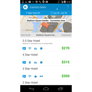
Priceline simplified the value-travel shopping experience with a UX that is instinctual and simple.
Discount travel requires customers to make some trade-offs to earn the best savings. The opacity around travel discounting can force customers to have to slow down to make several choices along the travel shopping experience, but mobile customers do not want to slow down, they want the best nearby deals, now! Priceline set out to deliver attainable experiences to our mobile-savvy budget traveler without the often-clunky and complex UI that can come with discount shopping. We are submitting two case studies that show how we artfully blended usability feedback, performance metrics and a/b testing with innovative usability treatments to tackle key user challenges that achieved measurable success, rewarding both the Priceline customer and our mobile business.
- Live Project Link: https://play.google.com/store/apps/details?id=com.priceline.android.negotiator
- Why this project is worthy of a UX Award:
Although budget-travel planning requires customers to make some trade-offs, Priceline mobile has differentiated value-travel shopping by aiding our customers in decision making along-the-way through instinctual experiences that make them feel delighted and accomplished.
- Submitted By: priceline.com
See More 2014 Submissions >>