
View Case Study
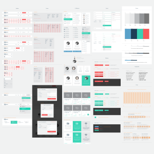
A complete, user-centered, principle-driven UX redesign of Codecademy.com
This was a four month project aiming at reimagining Codecademy from the ground up. We redefined every component under our brand, from a single button on our dashboard to our email template, business cards, slides and even apparel. Part of this comprehensive project was the redesign of 70+ webpages in tandem with other collateral material (email templates, slides, apparel, etc). We implemented and tested our new redesign under a well defined timeline, with multiple cycles and milestones, while in the process getting feedback from our community. We created a large amount of redlines for all the new material, started experimenting with some versions live on the site, and listened to dozens of comments from our selected users and moderators. All the work was driven by a defined set of UX principles, which you can read here: https://medium.com/@mslima/reimagining-codecademy-com-1ebd994e2c08 This blog post explains the entire design process in detail: http://www.codecademy.com/blog/141-codecademy-reimagined
- Live Project Link: http://www.codecademy.com/
- Why this project is worthy of a UX Award:
A well-structured, user-centered, principle-driven UX redesign of a product used globally by 24+ million users. Here you can read more on the main UX principles driving the redesign: https://medium.com/@mslima/reimagining-codecademy-com-1ebd994e2c08 https://medium.com/@mslima/horror-vacui-1af263f068bb
- Submitted By: Codecademy
See More 2014 Submissions >>