
View Case Study
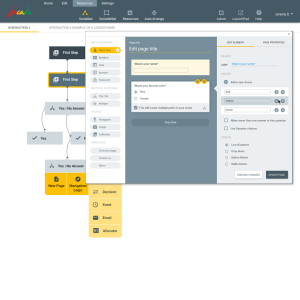
A complete rewrite of the Visual-IVR Interaction Designer from legacy Java client into a drag & drop web based editor.
Our development team in Jacada, a company specialized in customer experience, decided to take on a challenge and redesign the Interaction Designer, a complex business flow editor created over 15 years ago in older “fat client” technology. The biggest challenge was to keep all the great functionality added to the product throughout the years and make it available with an intuitive, updated web interface. This was no small feat given the rich experience made available within the client application and trying to recreate this experience in a web interface.
It was important to us that first time users will be able to hit the ground running, but also allow advanced users to be efficient by showing the next best action available when they need it and allow rapid building of customer interactions with the minimum number of clicks.
To add to the complexity of the design, the system needed a simulator that allows you to see the new flow as your users would, emulating either a desktop browser or a mobile browser.
Factoring into our design was the fact that non-technical users should be capable of building complex interactions, so concepts like variables, XMLs and Web services had to be presented in an easily digestible manner, heavily influencing the design of the interaction builder.
Components and attributes are made easily accessible, allowing users to search from practically anywhere, simply by starting to type or selecting via filters.
Some customer interaction flows are very big and spaghetti like so the new designer can automatically arrange the flow by applying auto-arrange logic, or, if you prefer, you can arrange it yourself.
Our interaction designer has not only pushed the limits of web implementations, it has been designed from the ground up to provide an environment tailored for business users to create complex customer interactions.- Why this project is worthy of a UX Award:
Since our product is available to anyone who would like to try it and start using it, a key aspect of the design was to make it self explanatory, so that first time trial users will be successful creating interactions, but also allow advanced users to do what they need quickly.
We did extensive usability tests on many different versions until both groups found the interface easy to use.
We learned that users do not want to read complex help documents, or even view videos. The ‘next best action’ should be in front of the user seamlessly, or at least, show the minimal number of options for the user to choose from.
Another important concept, was to try to show all required information on the screen, without the need of opening additional windows or popups
This exercise highlighted that usability often trumps functionality: The initial response was so overwhelmingly positive we accelerated the rollout as our users preferred the UI//UX to such an extent they were willing to sacrifice functionality not yet in the release/ - Submitted By: Jacada
See More 2015 Submissions >>