
View Case Study
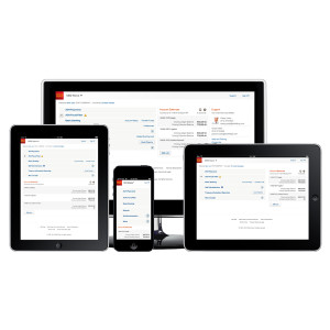
Wells Fargo used responsive design to help customers find information faster and complete tasks easily no matter which devices they use.
Wells Fargo successfully launched a multiyear initiative to implement responsive design across the online banking services customers access through our Commercial Electronic Office® (CEO®) portal, with the objective of ensuring our services look and work the same way on a variety of devices, including desktops, laptops, tablets, and smartphones.
Customers began using the redesigned CEO portal and the first of many redesigned CEO services in late 2014. Many frequently used CEO services are being redesigned throughout 2015, 2016, and 2017. Customers have found the redesigned services to be intuitive and easy to use, helping them find information faster and complete critical tasks easily. Responsive design provides customers with a consistent experience across the online banking services and devices they use.
- Why this project is worthy of a UX Award:
Industry research shows that customers are using a wider array of devices and browsers to access their banking services. Wells Fargo anticipated this trend, and we’ve redesigned our online banking products and services to work seamlessly across browsers, operating systems, and devices.
Wells Fargo’s data and user experience teams employed user-centered design principles and met with a number of customers at various stages of development. Customer feedback helped drive various iterations and enhancements before we rolled out the redesigned CEO portal home page and the first set of redesigned services. Additionally, product, user experience and technology partners collaborated to create an iterative design and development process, borrowing from both agile and waterfall approaches. Throughout the redesign, we maintained a simple philosophy – try new things, hold on to what works and keep moving.
The redesign has brought a number of key benefits to our customers:
• Provides a simple layout that makes it easy to access information and complete tasks quickly and efficiently.
• Allows customers to complete critical tasks without having to click through several pages.
• Makes it easy for customers to see when action is required – for example, when their approval is needed on an outgoing payment.
• Ensures our online banking services will look and work the same way on any device customers use – they don’t want to have to “relearn” how to use certain services because they don’t work the same way on a smartphone or a tablet as they do on a desktop or laptop computer.The central navigation, branding and clean look and feel, and consistent use of links and badges we’ve implemented with the redesigned CEO portal and CEO Mobile service are all part of a companywide focus on standards and simplicity for an integrated website experience, and a consistent user experience across a variety of screen sizes and devices.
- Submitted By: Wells Fargo Bank, N.A.
See More 2015 Submissions >>