
View Case Study
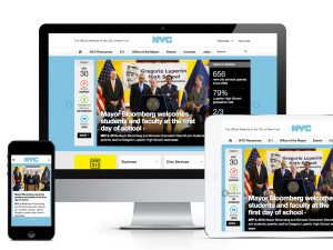
The City of New York engaged Huge to redesign its municipal website, NYC.gov.
New York City's municipal website, NYC.gov, serves more than 35 million unique visitors per year and gets more than 250 million page views annually. It is the primary resource for New Yorkers to accomplish tasks such as paying a parking ticket or figuring out which school is right for their child, and for the city to share its initiatives and accomplishments with its citizens. It had not been redesigned since 2003 and, over time had become a disorganized hodgepodge of text and links – it had become very hard for users to find what they needed and they were increasingly calling 311 (the city's public help line). The city had already started to invest in a new technology infrastructure, make city data more open and accessible, and this was the final effort to bring more power, information, and transparency to the people of New York. Our goal was to create a more intuitive, usable, and efficient experience that would be easy to search and browse, and a delight to use. The experience had to beat accessibility standards and work in many different languages. At a higher level, our goal was for NYC.gov to set the standard for the way governments communicate with and empower their people. The audience in this case was very broad. There are 8 million citizens in New York City and millions of commuters, business owners, and others who interact with the city regularly. Within that audience, there are different levels of digital experience and a wide array of digital devices. Our strategy started by conducting focused research – speaking with real New Yorkers about how they interact with their municipal government in general and the site specifically, reviewing the content and behavior analytics on the existing NYC.gov, reviewing other city and government websites, speaking to the many stakeholders and constituencies in the city government – to arrive on a cohesive strategy. Our vision was to do two things very well: First, create an experience that is a true resource for New Yorkers. An experience that enables users to quickly and easily complete simple tasks – like checking if alternate side parking is suspended today - and get their questions answered. Second, to provide a way for the mayor and the city to share all of the initiatives they are doing in more compelling ways. There are so many great things the city is doing for its citizens that are buried in press releases every day.
- Live Project Link: http://www1.nyc.gov/
- Why this project is worthy of a UX Award:
In order to create the most intuitive, user-friendly experience possible, we used a very iterative design process working in collaboration with the City of New York. While part of our team worked on the content strategy and information architecture, another group created design concepts to get the main interactions and look and feel right. Then we moved into detailed design, building out interactive prototypes and testing with real New Yorkers (who are never shy about sharing their opinions). Finally we partnered with NYC's tech team to bring the site to life. We created a responsive experience to enable people to access the site easily from any device. The old website was very flat and categories as broad as "business" were on the same level as "anti-graffiti initiative" so we created 8 meaningful content buckets that became the organizing principle for the entire experience. We also worked very hard to prioritize the information and tasks that New Yorkers need most, and put those front and center. For example, we made it very easy for people to file and track complaints with the city using the "311 booker" - with just a few clicks, users get answers to their most frequently asked questions and guidance on next steps. We also worked hard to create a look and feel that was friendly and approachable but also solid and dependable. To ensure the fastest possible load time and performance, we stayed away from any extra graphic frills and kept the design very simple. In terms of the site’s development, we created a standard modular template that can be reused, so that the city can grow and scale the system over time. There is now a better way for the citizens of New York to connect with their local government. The new NYC.gov helps New Yorkers learn about and take advantage of the many services and initiatives the city is putting forth. And the new NYC.gov enables New Yorkers to communicate more easily with their government about how they can all work together to improve their quality of life in their homes and communities. After the redesigned NYC.gov launched in September 2013, every comparative user study we performed said it was easier for people to accomplish their tasks and to find information they needed in the new experience. The day after the site launched, it was hailed by many as "setting the standard for government websites." NYC.gov has been revered on sites including Fast Company, Mashable, CNN Money, GigaOM, Gizmodo, and The Drum.
- Submitted By: Huge
- Client Name: The City of New York
See More 2014 Submissions >>