View Case Study
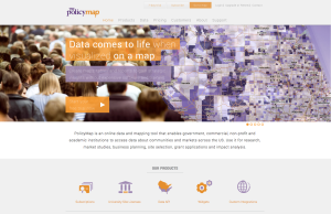
PolicyMap is a mission-based online tool that creates data-rich maps, tables and reports.
PolicyMap is an online tool created by a nonprofit, The Reinvestment Fund. PolicyMap brings data into the hands of the end users who need it. The site offers users the unique opportunity to have access to all open data, all in one place, and much of it for free. Data made available in PolicyMap is reliable, relevant, timely and accessible. With over 15,000 data indicators from hundreds of disparate sources, PolicyMap offers a one stop-shop for current demographics, real estate insights, health statistics, jobs trends and more. PolicyMap is a bridge between the vast datasets available in the open data space and end users who may not have the technical skills to access the data or the software to map and analyze it. And, for those organizations that do have this capacity, PolicyMap saves them time and money by making what they need available in a single resource. Whether it is an entrepreneur looking for a middle class neighborhood in which to locate a business, the urban planner in need of an inexpensive market study, or the community development organization wanting to see how vacancy rates have changed over time, PolicyMap allows them to access and visualize vast numbers of data quickly and easily. All public data is made available for free to the public in simple interactive maps and tables; subscription services allow for access to proprietary datasets and advanced analytic tools.
- Live Project Link: http://www.policymap.com/
- Why this project is worthy of a UX Award:
PolicyMap is a mission-based online mapping and data analysis tool. Since it was launched 7 years ago, we have made small updates to the platform but in early 2014, the site underwent a major overhaul. The result is a beautiful, easy-to-use and customizable visualization tool that allows users to quickly understand and analyze data, without training. With the upgrade, the site now boasts a contemporary interface with full screen maps, easy-to-navigate data menus, draggable legends, custom color ramps and data tools. PolicyMap’s new interface is very contemporary, much akin to popular online shopping websites, with simple yet robust data menus. The platform is powerful and built for the web, allowing users to render data rich maps fast. In addition to mapping and table tools, PolicyMap offers a data loader that allows users to upload address level data and leverage their own data with the thousands available in PolicyMap. PolicyMap also allows for users to find hot spots or areas that meet up to 3 criteria on a map using the 3-Layer Mapping feature. Let’s say you want to find areas with low unemployment, affordable homes, near mass transit. You can do that in just a few clicks using 3-Layer Maps. PolicyMap deserves a UX award for the elegant yet intuitive user experience it provides that furthers its nonprofit mission of democratizing data while giving users the power of accessing and understanding data.
- Submitted By: PolicyMap
See More 2014 Submissions >>