
View Case Study
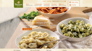
The new PaneraBread.com is an immersive and sensory web experience.
At the start of the project, Panera had six disparate sites, each with different branding and navigation, and each telling the Panera story in a different way. The goal was a single, brand flagship site that would encapsulate everything these sites were communicating in one cohesive experience. In conjunction, the team had to re-platform onto a single content management system, so the design, content integration, and replatforming projects were happening together, in concert. The key to success was bringing the experience customers love about their nearest Panera bakery-cafe—the craftsmanship, the notion of place to linger, the sensory appeal of the food itself, the feeling of community and shared social values— to the digital experience. We started with with a cohesive architecture that was all about seamlessness and relevancy, guiding users through the offerings, helping them go deeper and find more, and creating opportunities for community. The unified site needed a fresh visual style to reflect and underline the brand’s commitment to community and craftsmanship. Heroing the food was the key to craveability. We looked for ways to bring the deliciousness into the spotlight and add editorial content to make it more visible and actionable. To give commerce a boost, we focused on anticipating and serving up relevant content based on location and time of day, making enjoying Panera easier and more appealing. From six disparate web experiences, we created a responsive, unified site that dramatically amplified the entire brand experience.
- Live Project Link: https://www.panerabread.com/en-us/home.html
- Why this project is worthy of a UX Award:
In a single destination, PaneraBread.com tells the story of an expansive brand that stands for so many things, yet anticipates individual customer needs and serves them relevant connected content. PaneraBread.com is the first digital restaurant experience that focuses on getting to know their customers as individuals and building a one-to-one relationship. The unified site was designed for a frictionless browsing experience that brings together brand values with culinary content and menu items, connecting them to the Panera community that powers the brand. The experience is organized around the idea of relevance. It offers up a smart, dayparted experience customized to the user’s time and location and uses a sophisticated locator tool to allow filtering by restaurant services so users can find a bakery café that’s just what they want. Content is tagged into themes that appeal to different brand segments—from the educated food influencer to the functional eater— and a related content strategy encourages consumers to break out of old habits and try something new. The careful choreographing of each of every facet of the brand into a single experience brings the richness of Panera Bread to life.
- Submitted By: SapientNitro
- Client Name: Panera Bread
See More 2014 Submissions >>