View Case Study
Method redefined the LUSH brand experience and connected with the story behind its products.
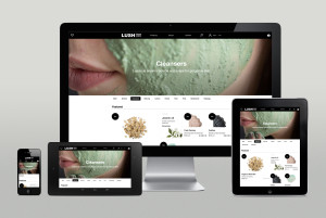
Method has partnered with LUSH, the British cosmetics brand, to redefine their brand experience and connect consumers with the story behind its products. Setting out on an eight-month program, Method worked closely with LUSH to develop a new digital brand strategy and design direction across multiple channels. This included the transformation of Lush.co.uk into an editorially-led, fully responsive e-commerce platform; the redesign of LUSH’s print consumer magazine “The LUSH Times”, and the creation of the new exclusive online service “LUSH Kitchen”, where digital becomes a sensory experience. Here, customers can get access to exclusive, limited edition products made fresh daily and get a closer look at how those products are made. Aware of how digital platforms influence and shape the customer buying journey, LUSH came to Method looking for a compelling way to tell their incredibly rich story, which is focused on the welfare of its suppliers and a genuine and transparent approach to business. Working closely with the team, we encouraged LUSH to take bold steps in their digital journey and challenge the standards in the cosmetics and digital industry by capturing a sensory experience online. We then worked alongside the print team to implement the system and make sure Lush could own the process for future editions. Last but not least, we developed the concept and brand strategy for a new service, the LUSH Kitchen – a brand new concept where small batches of fresh, handmade cosmetics are made daily and available to purchase exclusively online. Customers get a view ‘behind the scenes’ with real-time updates on social media and expert Q&A’s streamed live. We selected a name that represented the proposition; defined the brand and service strategy; designed the customer experience and delivered the service as part of the beta release of Lush.co.uk. On March 31, 2014, the brand transformation program came together with the launch of lush.co.uk, Lush Times and Lush Kitchen. The final output is a design system that has the flexibility to blend editorial with product, connects print with digital, and can scale internationally. The website received a standing ovation upon unveiling it to the company and customers have been overwhelmingly positive. Commercial success has quickly followed with a sales increase of 21% YOY reported in the first week. Further site refinements and an international roll out is scheduled through 2014. Lush Times is now available nationwide and internationally with Lush Kitchen as the front cover and leading story. Customers have embraced the new service with products selling out as soon they go on sale and positive responses on social sites.
- Live Project Link: https://www.lush.co.uk/
- Why this project is worthy of a UX Award:
Method’s ultimate challenge in our work is to design a complete experience for our clients. LUSH is the complete package where the UX design is the foundational system that supports insights, strategy, and brand development. The final product tells LUSH’s story in a meaningful way, while maintaining honesty in its message and beauty in its design. We feel this type of work showcases not only the ability of our design team, but also the ability of the entire project team to cohesively create a system that gives our clients long-lasting applications that directly influence their business strategy. Lush’s growth of 21% in online sales immediately after the launch of the new website is a reflection of that commitment.
- Submitted By: Method
- Client Name: Lush Cosmetics
See More 2014 Submissions >>