
View Case Study
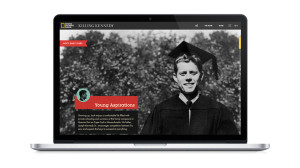
KennedyandOswald.com was the interactive companion site for National Geographic Channel’s Killing Kennedy docudrama.
During the media chaos surrounding the 50th anniversary of JFK’s assassination, we were faced with a cluttered online landscape. We broke through by telling not one story, but two— Kennedy’s and Oswald’s. With the two sides of the site pushing away from each other, we showed their lives moving in opposite directions, only to meet one fateful day in Dealey Plaza. The site has two core features. Opposite-direction scrolling reinforces the storylines at play. “Passive parallax” allows users to explore 2-D content in an unobtrusive 3-D way. The core style of the site is reminiscent of a different time—the early 1960s in both the US and the USSR. We allowed mobile device orientation data to control site elements the same way mouse position does. If you visit KennedyandOswald.com on a smartphone or tablet, your device’s tilt influences the parallax throughout the entire experience.
- Live Project Link: http://kennedyandoswald.com
- Why this project is worthy of a UX Award:
For KennedyandOswald.com, our goal was to make the dividing line between creativity and technology indistinguishable. We focused on the user experience first, creating an interaction mechanic that’s also a narrative device. A top priority throughout the project was to not just create another parallax site, but a responsive, cross-platform experience where the scrolling functionality actually intertwined with the story.
- Submitted By: Mullen/Mark Boroyan
- Client Name: National Geographic
See More 2014 Submissions >>