
View Case Study
Chrysler Group Mobile Brand Websites Redesign
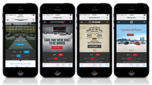
The first iteration of Chrysler’s mobile sites was launched in 2011. Since then, dramatic changes and evolutions in the mobile industry have called for a re-thinking and redesign of the sites. Additionally, the previous mobile sites no longer reflected the look and feel of the individual brands, including: Chrysler, Fiat, Jeep, Ram, and Dodge. In particular, there were notable design and user experience challenges that needed addressing. Each site lacked the flexibility to accommodate the needs of the brand in terms of messaging, content and interaction. Accordingly, each site was unable to scale as the brand-level content and tools progressed. Each brand had a very brochure-like mobile experience and didn’t align to the needs of the car shoppers. The sites needed to be modernized to allow for more gesture-based functionality, better image and content optimization, and the installation of an intuitive content hierarchy to expedite users to important vehicle and shopping content. The sites were also in need of an extensible solution and design system to maximize a singular budget and the desire to create a framework for five distinct brands. 2013 marked the reinvention of the Chrysler brand mobile sites for a richer, faster, cleaner, and easier experience for new vehicle consumers. The particular UX and design system challenge came in the form of trying to create a highly functional template system that provided each brand a set of highly customizable components that could flex to allow for brand individuality. This also provided us with tremendous efficiencies in designing a system that could enable individual brand characteristics and thinking. The final experience integrated product content with brand content, and emotion with logic. We also created a usage and governance guide for brands to reference when creating new content for the sites. Each brand was then unleashed to populate, define, and build out the templates in accordance with the guides, and content hierarchies defined and provided by the team.
- Why this project is worthy of a UX Award:
2013 marked the reinvention of the Chrysler brand mobile sites to create a richer, faster, cleaner and easier experience for consumers in the market for a new vehicle. The solution was an integrated design system that married product and brand content, emotion and logic, lifestyle and tools. It was one system, which morphed to adhere and adapt to the nuances of each Brand. The result: three months after the launch Chrysler saw a 6% increase in conversion rates to shopping tools, a 14% improvement in vehicle landing page visit rates, and a 4% decrease in no-click bounce rates.
- Submitted By: SapientNitro
- Client Name:
See More 2014 Submissions >>