
View Case Study
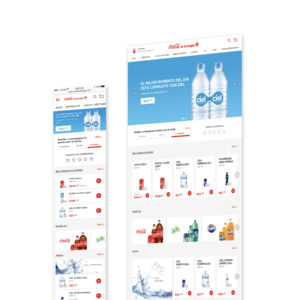
Propelland redesigned Coca-Cola Mexico’s e-commerce platform to improve the user experience.
Coca-Cola Mexico hired propelland to re-design its home delivery e-commerce platform in order to improve the ordering experience, as well as to improve conversion rate from offline users (who order by phone) to online users (who order through this platform). After conducting primary research and identifying the key barriers in usability, the team worked with the following design principles:
The design should reflect a user-centric and service-focused experience in order to make the user’s life easier, by unifying the entire ordering experience throughout all touch-points. To achieve this, the design should be:
1. Intuitive: the experience must be simple and straightforward. It must also work for all kinds of people, regardless of age or device.
2. Visually informative: The design should present just enough information, in a simple informative way helping reduce clutter and improve conversion to sales.
3. Personalized: offerings and recommendations always feel tailored to the user and anticipate their needs.After several iterations, the team re-imagined the platform with the following key improvements from the existing design:
• A unified desktop and mobile experience: Unified navigation between both mobile and desktop & Responsive design between desktop and mobile web
• Lead aesthetics with brand visuals while simplifying typographic treatment
• Relevant information must be given proper hierarchy
• Tailor promotions to the user and give them strategic placementThe final re-design provides a seamless and integrated experience between devices and creates an intuitive shopping and re-ordering experience.
- Why this project is worthy of a UX Award:
The future of e-commerce is mobile and the smartphone is the primary purchasing tool. The re-design of Coca-Cola Mexico’s e-commerce platform integrates the mobile and desktop experiences. Armed with the knowledge that the majority of existing platform users are android owners and make purchases using cash, our design fluidly conforms to needs of the user and works with both android and ios devices. In addition, the platform encourages users to improve their own experience by incentivizing credit card payments through automatic reordering.
One challenge we faced—that is present in multiple e-commerce sites—was the lack of unified renders of all the portfolio products. This, in turn, made it difficult to communicate different pack sizes and types. We solved for this through various tests and designs. Our final solution could be replicated for e-commerce platforms that don’t have access to original renders by their suppliers.
Furthermore, the operations of this site are highly complex because there are different stores attached to each zip code (which affects product availability and prices). The original design solved for this through a zero zone starting page where the user could navigate but wasn’t able to click or purchase anything. This caused a lot of frustration for users. We solved for this issue through a landing page that immediately asks users to enter their zip codes in order to see their local portfolio and prices.
- Submitted By: Propelland
- Client Name: The Coca-Cola Company Mexico
See More 2017 Submissions >>