
View Case Study
Oracle HCM Cloud encourages user adoption and participation through ease of use and consistent design.
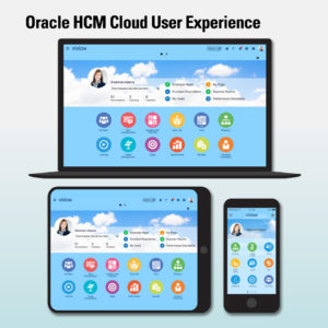
Oracle HCM Cloud user experience (UX) streamlines and modernizes human resources processes. Its clean, contemporary user interface and work flows make human resource (HR) functions painlessly accessible to any user. Easy-to-use features have been influenced by the familiar interactions we see online every day. Oracle HCM Cloud is tailored to users’ roles. It allows them to efficiently navigate the system, and quickly moves through HR tasks. Its contextual design presents the right information at the right time to the right person.
Oracle HCM Cloud is designed for employees to help them with their everyday tasks such as time entry, learning, maintaining skill levels. It’s also designed for executives who are responsible for keeping HR aligned with the business as well as managers who are responsible for recruiting new talent and growing their organizations.
- Why this project is worthy of a UX Award:
The Oracle HCM Cloud UX has been rethought from top to bottom. We knew we wanted to create an experience that was contemporary, leveraging new and emerging consumer expectations. To Oracle, this has been more than just making a pretty UI for our enterprise software. We needed a holistic experience that transcended devices. The result is a design that moves seamlessly from smartphone to tablet to laptop to desktop, all while maintaining a consumer-friendly user experience that encourages engagement.
The next layer of the UX is in the design of the work itself. A modern HR system needs to be simple. We operate under a design philosophy of “glance, scan, commit.” The idea is that a user should be able to glance at the UI to understand what needs action, scan through a dashboard or similarly designed page to get the next level of information or take a lightweight action, and commit to using the software as needed for performing more complicated work. This philosophy has fundamentally transformed the interaction design of our entry experience and our transaction pages. In our Learning UI, for example, an employee can quickly glance to see what required learning is still needed, scan to understand what their peers and colleagues are also studying, or commit to deeper learning at any time with one gesture.
Oracle has also invested in providing a complete UX tool set. Our tool set allows any Oracle customer to easily modify visual elements in the UI that reflect company culture, such as the brand. In addition, language in the UI can easily be modified, along with business processes and work flows, to reflect a consistent employee experience. A key goal behind Oracle’s UX tool set is to increase employee participation in the system, and our research shows that consistent branding and processes that reflect the company culture go a long way in reaching that goal.
- Submitted By: Oracle Applications User Experience
See More 2017 Submissions >>