
View Case Study
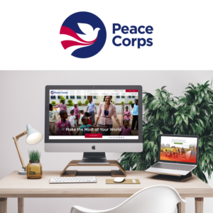
The Peace Corps Unveils New Website to Engage Next Generation of Service-Minded Americans
"Peace Corps is dedicated to Volunteer service, sending Americans abroad to tackle the most pressing challenges around the world. Peace Corps Volunteers are invited by host countries and work at the grassroots level to create change that lasts long after their service. They go where they're needed, and they “bring the world home.”
Potential Volunteers rely on the Peace Corps website to gather information about volunteering and ultimately apply. Peace Corps received nearly 23,000 applications in 2015 with nearly 7,000 Volunteers currently serving in more than 60 countries.
From the outset, we understood that the Peace Corps website meant a lot to the people within the organization and the many different stakeholders they represent. Forum One felt it was important to understand all of the different needs and interests as part of the development. We devised and led a series of in-person workshops to prioritize audiences, understand internal and external needs, and most importantly, hear everyone’s voice.
Internally, we understood equally well that this would be a big, big project, and that a collaborative effort was vital to ensuring we were on the same page from start to finish. We therefore staffed our team with a number of creative-minded folks, all with different strengths — from user experience to content strategy to visual design. Coupled with regular, in-depth co-working sessions with the client team, we set our team up for success from the beginning.
Together, Forum One and the Peace Corps launched a new intuitive site. This government site is accessible, beautiful, and inspiring! We continue to make additional improvements and enhancements. Together, we’re working to shape an online experience that resonates with a new generation of Peace Corps Volunteers interested in making a difference in the world."
- Why this project is worthy of a UX Award:
"We believe this is a great example of a usable, beautiful, responsive government website. The user experience design optimizes pathways for volunteers to apply. The stunning visuals and compelling content tells the story of what it’s like to be a volunteer. The refreshed platform is built to fit Peace Corps’ unique mission, telling a compelling story that is authentic, fresh and engaging while still honoring the agency’s historic roots.
With the close collaboration with primary audiences, project stakeholders, and the design team, we were able to create a vision and strategy, brainstorm ideas, and ultimately restructure a large site to be more intuitive, extend the Peace Corps brand online, and tell a story.
A robust discovery phase, paired with a design phase filled with sketching, prototyping, and critique led to a modular design system that will serve Peace Corps for years. The new site features a fresh design that is bold, compelling, and inspirational, and puts the volunteer experience at the center, with an emphasis on authentic narratives, captivating imagery, and volunteer-generated media. People can easily navigate content and are presented with the most current and useful information at every point of their digital journey.
The results go beyond a smart UX and a striking design. The new structure and design system gives Peace Corps the ability to quickly scale and manage their content more efficiently. With this strong foundation in place, Peace Corps is ready to present a new look to engage the next generation of Americans, eager to use their talents and ingenuity to improve the lives of others around the world."
- Submitted By: Forum One
- Client Name: Peace Corps
See More 2017 Submissions >>