
View Case Study
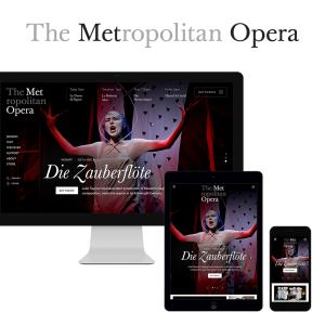
The Met Opera partnered with us to revitalize an art form.
Since opening its doors in the late 1800s, the Metropolitan Opera has been one of the country’s leading cultural institutions. Despite working hard to innovate, The Met still faces a crucial challenge: how to make opera relevant to younger audiences. Work & Co was engaged in 2015 to reimagine the Met’s digital presence. The goal was to revitalize an artform by creating a new platform that works across all devices to increase ticket sales and create a new generation of opera fans.
We started by conducting field work with various user groups, to understand their domain and how they discovered, selected and viewed opera performances. The goal was to revitalize an art form. Using an iterative design approach with weekly prototype builds, we worked closely with the Met to streamline their business around ticketing. The ticket workflow was simplified so that could be purchased on any page using an intuitive event calendar. Users get a sneak peek at views from a selected seat to spark anticipation ahead of a show. Donations and giving are integrated at natural points in the user’s path.
Inspired by the opera house, the new design uses black and white contrast to add both drama and utility. Like the front of house, white is used for informational sections of the site, while black is used for “lights-down” immersive experiences. To enable associative browsing, the design switches to simple, full screen text lists paired with a one-of-a-kind, editorial-style production page. To showcase the Met’s rich content, we developed an digital On-Demand platform, with access to the full historical archive of performances. It features a custom video designed and built specifically to provide an immersive experience with Opera.
- Why this project is worthy of a UX Award:
Since launching in June 2015, the new Met Opera digital platform has exceeded all expectations, attracting a new generation of opera enthusiasts while increasing engagement with existing fans.
Today, the design solution seems simple, almost inevitable. But in reality, the project began with a wide range of potentially conflicting user goals and business drivers. For example, to increase sales, we needed to find a way to increase sales by introducing more familiar ecommerce design patterns. But the design also needed to express the rich magic of the opera experience. Similarly, we needed to help the Met retain its fiercely loyal fan base, while introducing younger generations to the Opera.
How did we resolve these diverse goals? The entire design solution ultimately turned on a few key insights we gained from our field work with opera fans. We learned that while there is a large appetite for content about specific operas and performers, the majority of site visitors were surprisingly goal-directed, so content should be integrated into their workflow in support of their highly specific goal for that session. The new online platform manages to be immersive yet transactional, prestigious yet approachable.
- Submitted By: Work & Co
- Client Name: The Metropolitan Opera
See More 2015 Submissions >>