View Case Study
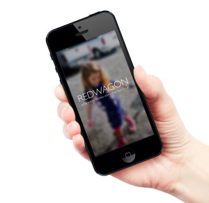
A mobile app and car service that provides transportation with car seats - for families with young children.
REDWAGON is a mobile app designed for a family transportation service created as a final project for a User Experience Design class at General Assembly. Preliminary research on how families were getting to and from the airport and other destinations with their young children began with online research through parenting websites and blogs followed by an online survey and in-person interviews with caregivers and car share employees. Ideation then followed with possible solutions discovered through user research. Hand sketched and interactive web and mobile prototypes were then created to explore what platform would be most useful for busy families on the go. Ultimately a mobile app was decided upon.
What problem is REDWAGON trying to solve? Families with young children have a hard time getting to and from various destinations, especially the airport. The solution a mobile app and transportation service with car seats – for families with young children.
The mobile app allows families to:
• Select a pickup location
• Choose a car seat
• Add an upgrade and
• PayREDWAGON offers a new way for families to travel safely and timely without having to worry about carrying extra gear.
- Why this project is worthy of a UX Award:
REDWAGON is worthy of a UX Award because it tackles a real problem. A problem most families are too embarrassed to admit. In the three-month period it took to research, iterate and prototype REDWAGON, I not only learned to empathize with other families, but also faced the challenges myself. Traveling with a young child for the first time, as a parent is stressful and taxing. You hear stories but you never fully understand until you do it yourself, it’s an art.
REDWAGON embodies the 5 key UX phases: user research, analysis, design, user testing and prototyping. User research helped me understand what families were dealing with when traveling; their pain points, their strategy, and their feelings. After understanding my users I was able to identify design opportunities through ideation. A lot of the ideation process couldn’t have been done without my interviewees and their suggested ideal situations. Conceptualizing and exploration allowed me to put my thoughts on paper, literally. I was able to begin testing my idea right away using hand drawn sketches. User testing and evaluation of my design I’d have to say was the most gratifying part of the process. It was even better when I was able to implement the changes suggested in my final prototype.
- Submitted By: n/a
See More 2015 Submissions >>