View Case Study
With 1000s of hand painted animations, this responsive site enables users to enter into and become a living part of Jesus' historical world.
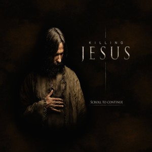
We were tasked with creating a second-screen companion website experience for National Geographic Channel's historical drama, Killing Jesus. In addition to creating excitement in the lead-up to the show, this needed to be a companion piece to the broadcast film, something that enhanced the viewer's experience with new content. Since we were free to develop a concept of our own, we decided to go beyond the film's single, well-known perspective. Instead, we told the story from three distinct points of view, to show events from all sides, using historical sources as our reference. In this way we were able to give additional insights and context to perfectly complement the dramatization in the film.
We gave viewers the ability to explore the story of Jesus in a new way through eight pivotal chapters with three distinct points of view. Users fluidly move through multiple parallax scenes in each side-scrolling panorama and learn more about characters, locations, events and historical writings. We used over 3,000 hand-painted illustrations to bring our vision to life, an original score and 185 scroll-triggered audio files, including voiceover talent from the film. We ensured that the experience would work seamlessly across all mobile devices without compromising the beauty of the illustrations or users' ease of movement through the site. To make this breakthrough experience possible, our developers created an original software script that automatically converted After Effects motion files into HTML markup, CSS styles and keyframe animation data that smoothly played in web browsers.
Since launch, the site has received 616,000 visitors, with an unprecedented 150,000 unique visitors from 179 different countries on the night of the show, two-thirds of whom accessed the site through mobile and tablet devices. In a world where engagement is usually measured in seconds, visitors stayed on the site an average of fifteen minutes, sharing out the URL over 11,000 times.
- Why this project is worthy of a UX Award:
The Killing Jesus experience brings the greatest story ever told to life to enable users to become participants in history through the innovative use of multi-perspective navigation, hand-painted illustrations and browser-native animation code. Other key points:
• We used over 3,000 hand-painted illustrations to bring our vision to life, an original score and 185 scroll-triggered audio files, all delivered seamlessly over desktop and mobile devices;
• To make the responsive site possible, developers created an original software script that automatically converted After Effects motion files into HTML markup, CSS styles and keyframe animation data that smoothly played in web browsers;
• The site has received 616,000 visitors, with an unprecedented 150,000 unique visitors from 179 different countries on the night of the National Geographic Killing Jesus show.
- Submitted By: Mullen Lowe U.S.
- Client Name:
See More 2015 Submissions >>