
View Case Study
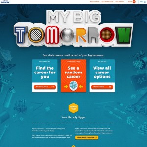
My Big Tomorrow is a resource designed to help young Australians realise bigger life choices.
The purpose of My Big Tomorrow is to improve the literacy and numeracy skills of 15 and 16 year old Australian high school students from low socio-economic backgrounds. The ultimate goal is to help them graduate from University. The initiative is sponsored by the Centre of Excellence for Equity in Higher Education at the University of Newcastle, Australia.
After extensive consultation with high school students, we determined that there was a lack of useful resources available to help them understand career choices. This is a problem Australia-wide. My Big Tomorrow was created to fill that void with inspiration, information and education. It is also designed to give them an understanding of the skills they will need in order to succeed in their chosen career.
Our mission was to create Australia’s first useful careers website. The strategy was to connect with students around their interests and open their minds by showing a ‘day in the life’ of careers they probably haven’t heard of. The target audience is 15 and 16 year old Australians, nation- wide. While the project’s focus is helping high school students from low socio-economic backgrounds, we broadened the audience to create the first useful careers websites for high school students Australia-wide.
- Why this project is worthy of a UX Award:
Before we lifted a sharpie we interviewed students and teachers, and we didn’t stop interviewing and testing until we got it right. We designed the ‘discover a career’ matching tool around the things 15 and 16 year olds really care about, like being part of a team, music and helping others. We made sure the type-ahead search had the right synonym hinting so “guitar”, “dogs” and “football” would return relevant results. This is the Google generation and our search synonyms are based on user research. We added just enough interactivity and user feedback to the tactile buttons and interface elements. We know our audience loves StumbleUpon and we made stumbling a popular website feature - the website’s averaging over 300 ‘stumbles’, or ‘Career-a-majig’ presses, per day. More stats later in ‘Success’.
We created a film for the website’s launch to explain why we created My Big Tomorrow, introduce some of the students involved and show feedback from teachers and careers advisers. The 3 minute film is here: http://www.mybigtomorrow.com.au/about. During the film, a Deputy Principal says:
"The fact that My Big Tomorrow links careers and University courses into school subjects is one of the best things about the website. It allows students to see the relevance of what they're studying at school now."
This relevance is what’s been missing. It’s why so many of our target audience don’t graduate from University (or even stay in school). Learning isn’t relevant to them. We believe UX has created the relevance for students with an inspiring student- focused web and mobile experience that opens up their minds. In the words of students in the film:
“It just brings you in, it’s like yeah, I really want to do that!”
“It really inspires you to think about tomorrow and what you could do and how big it could be.”
After almost 100 days live, My Big Tomorrow has shown impressive usage nation-wide by a hard-to-impress audience.
- Submitted By: The Village of Useful and Newism (joint entry)
- Client Name: The University of Newcastle
See More 2015 Submissions >>