
View Case Study
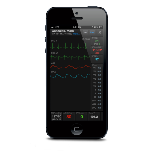
AirStrip ONE® is a medical application designed to present clinically relevant patient data to caregivers.
The AirStrip ONE application is the culmination of 10 years of mobile medical application development across multiple healthcare service areas. The goal of the AirStrip ONE design was to merge all of the individual AirStrip healthcare applications into a single product that focuses on presenting caregivers with the most clinically relevant data available for the patient by taking into consideration the role of the user, the current condition of the patient and the diagnosis during the hospital stay. The application is capable of supporting one or many hospital sites for a single caregiver that may have patients across multiple locations. These patients are grouped and organized into lists based on admissions, problems and diagnosis, primary physician and area of care. Patients may also be identified through a comprehensive search feature. The application design, including workflows, navigation, data presentation and user interactions have been carefully reviewed and studied by experts in their respective fields, innovation specialists and a team of highly experienced interface designers.
- Live Project Link: http://www.airstrip.com/solutions
- Why this project is worthy of a UX Award:
AirStrip ONE is an industry defining technology for mobile medical patient monitoring. It is truly unique from other systems available from both within a hospital setting and applications that are available in the mobile space because it aggregates data from disparate healthcare systems in order to present a common patient status from the time they are admitted into the hospital and continuing to outpatient, home care following discharge. The careful attention to the following design details sets this application apart from any others in the mobile space: • Navigation and Workflow • Efficiency and Order of Presentation • Minimal Relevant Design Approach • Indication of Actionable Items • Multi-Platform UIX Design • User Adoption and Customer Feedback Navigation and Workflow The design team initially focused on developing the navigation model to ensure that it consistently served the intended workflow across the various specialties supported within the application. The focus throughout was to incorporate a means to allow the user to visually understand the exact location within the application and very clearly identify the patient that is being viewed, while maintaining an efficient and consistent access to more detailed patient data. Efficiency and Order of Presentation With the amount of data that is being aggregated, derived and processed across multiple hospital-based systems, it is imperative that the user interface process and present data for an application in a manner that remains responsive for the user. AirStrip has created a cross-platform, design presentation language for the specific purpose to control the display of this intensive data processing. This also serves as a mechanism to speed delivery of the design across multiple OS and platform specific devices. Minimal Relevant Design Approach The display logic used on the dashboard identifies the minimal, relevant data that is used for the specific patient and the caregiver that is viewing the data. Each state or size of component on the screen is populated with data that is most important to the caregiver viewing the dashboard. As the size of the control(s) increase they reveal more data that is of interest or that needs to be viewed in more detail. Ultimately, the data presented may need to be investigated wholly in which the data is then viewed in full screen mode. This approach allows the application to present a complete overview of the patient’s current state. Indication of Actionable Items The AirStrip ONE design approach takes a very detailed approach to identify and call-out actionable items within the application. Font’s are enhanced and presented with treatments throughout the application for alerts, warnings and messages. There is also an employed color scheme to identify trends, severity and critical states. With a consistent color pallet and coordination of font styles the application presents a very user friendly and comprehensible approach to user interaction. Multi-Platform UIX Design The framework that supports the UIX design is cross-platform compatible with iOS and Android devices. This enables a fluid and consistent user experience for users that have access to the application on multiple devices and platforms. Adoption & Customer Feedback AirStrip’s ongoing focus groups and user feedback surveys reveal a steady adoption and an extremely short learning curve to understand all of the features that exist within the application.
- Submitted By: AirStrip
See More 2014 Submissions >>