View Case Study
Mobilepay makes it just as easy to send money as sending an SMS
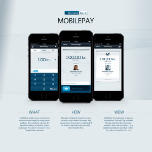
MobilePay is designed around the main purpose: easy transfer of money. For many people, it was a hassle to transfer money to each other with existing m-banking solutions, as it required at least two things: sharing account numbers and using our national login-system NemID, which is a physical card with keychains. Both are obstacles not designed around the social context of transferring money, making it both difficult and awkward. Signing up with MobilePay is extremely easy and it is done directly on the mobile. MobilePay enables users to send and request money simply by using phone numbers. No account numbers, no emails, no special codes. Even if someone doesn't have Mobile Pay installed yet, the person will receive a text message, saying that money is waiting. By introducing automatic selection of input fields and drastically cutting down on unnecessary details and steps such as OK and confirm functions, we have managed to reduce the normal 16 steps to only 6. After entering the amount and selecting a recipient you just have to 'slide' to confirm the transfer, which makes it incredibly easy for users to send money.
- Live Project Link: http://submission.dk/danskebankmobilepay/captions/
- Why this project is worthy of a UX Award:
On the surface MobilePay is just a very simple way to transfer money between people with mobile devices. The simplicity, however, is the product of a painstaking UX process which innovated not only the visible interface, but also the underlying business processes. MobilePay has revolutionized mobile banking in Denmark, because our client – Danske Bank – was able to think differently about customer experience on digital devices. Traditional banking apps have a tendency to expose users to excessive amounts of underlying business complexity. The objective of this project was to hide the complexity and leave only very simple and intutive selections for the user. On MobilePay you only have to type in your account and credit card information, and then the app automatically finds out whether to transfer money via an account-to-account transaction or via credit card transfer. In some cases this means that Danske Bank has to pay the credit card fees, which adds up to a significant amount of money on an annual basis, but Danske Bank has decided that this expense is worth the cost, because it creates a cleaner user interface and a much better solution. Danske Bank understands that a user friendly interface becomes very effective marketing, which is worth several million dollars per year. Mobilepay perfectly exemplifies how business process innovation sometimes is an important prerequisite for user friendly interfaces. The interface of MobilePay and the underlying technology is cutting edge and perfectly optimized for mobile users, but none of this would have been possible if the underlying business processes had not been elaborately designed with the user in focus.
- Submitted By: In2media
- Client Name: Danske Bank
See More 2014 Submissions >>