
View Case Study
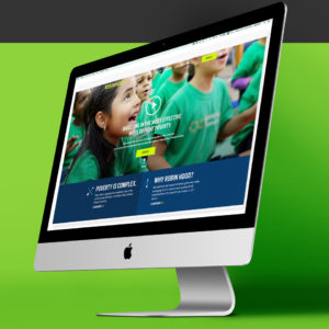
RobinHood.org helps raise awareness, raise funds and provide grants to organizations that fight poverty in NYC.
"Robin Hood is the most prominent philanthropy organization working to combat poverty in New York City. It offers funding to poverty-fighting nonprofit groups, selecting their grantees using cost-benefit ratios to get the most impact. We had been working with them for almost a year on strengthening their infrastructure before beginning work on the redesign. Their site is content heavy, serves many business units, and integrates with a variety of third party systems. Redesigning such an important component of their business which they use to raise money, find grantees, and promote new programs and events, was a complex and sensitive task.
Because Robin Hood has many stakeholder groups, part of the challenge was making sure everyone had a chance to communicate their goals for the site. We gave direction to Robin Hood's team so they could review their goals, explore user stories, and create a preliminary sitemap. We also studied analytics from their existing site to see if user activity reflected their goals. Our teams worked together to refine the site architecture and then ATTCK created wireframes and prototypes. The biggest challenge was creating the homepage, which had to satisfy all the stakeholders, use obvious calls to action, and have no clutter.
We designed clear pathways to donation, grant application, newsletter signup, volunteering, and attending events. As part of visual design, we also created a set of playful new icons and a fresh color palette, which communicate friendliness and professionalism."
- Why this project is worthy of a UX Award:
"Our redesign provided bold brand enhancements and clean new navigation paths that achieve new executive business goals. Their corporate shift towards becoming a thought leader centered around a completely reimagined content strategy.
Our administrative and editorial workflow enhancements are now seamlessly integrated, including years old legacy content that we migrated to the new system. The emphasis is now on their data-driven grant process and providing information around the huge amount of philanthropic work they do.
All of the changes we made took into consideration years of user behavior data and user feedback. The new information architecture is far more intuitive, and business goals have clear calls to action throughout the site. Working extensively on this strategy with stakeholders before beginning UX was directly responsible for the success of the redesign.
Robin Hood’s mandate is to raise money for the 1.8 million NYC residents living in poverty. The new site reflects their mission as much as it reflects our own feelings of empathy towards fellow New Yorkers."
- Submitted By: ATTCK
See More 2017 Submissions >>