
View Case Study
Real PMI-people share the ‘Designing a Smoke-Free Future’ vision, on the fresh dynamic new website
The world's leading tobacco company Philip Morris International is in the biggest transformation in its existence.
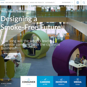
It is developing smoke-free products and has the ambition to design a smoke-free future. This vision comes to life in a fresh and dynamic new corporate website.
Above all, you discover a very human face, illustrated by carefully balanced and positive copy, excellent images and videos showing real PMI people at different levels of the company and in different sectors. They all share the pride of belonging to a society they believe in.
The website meets all objectives:
1. Share the 'Designing a smoke-free future' message
2. Develop a dynamic and intuitive user experience
- Show real PMI people, real stories
- Tell the story with top photos and videos
3. Direct and fast access to key content
4. Provide dedicated functional sections to key personas with specific needs (job seekers, press, investors)
5. Integrate information from external sources
Using Progress Sitefinity CMS, the team improved usability, enabled internal stakeholders to create and maintain pages and content, and seamlessly integrated NASDAQ systems and TALEO. The new tone of voice, design and style, the clear relevant content, integration of videos and photos of PMI people, all come together is a very attractive experience for all target audiences.
Pmi.com scores high marks on industry standards for all major parameters, with a very positive average time spent on the pages by the different types of visitors.
In two months following the launch, the site attracted over 800,000 visitors, with more than 50% qualified entries, on average browsing for 5 minutes. More than 15,000 media contacts visited the news section, and nearly 190,000 job seekers checked out the lively careers section.
- Why this project is worthy of a UX Award:
PMI.com is a first-in-class example of successful complex storytelling and data introduction.
In an attractive and to the point way, we used personas, and created a fresh design, excellent visual elements and video, while fluently integrating external data sources.By maximizing Sitefinity’s scalability and feature-rich tool set, the content is fresh and dynamic, with various internal teams actively participating in page and content creation, and new company projects are fluently integrated in style.
As a result, pmi.com proposes an innovative navigation model by content for the narrative sections:
- the general visitor can have an overview per topic at a glance, and dig deeper in the topics that are most interesting for him,
- specific personas with practical needs find straightforward answers to their questions in 'their' functional sections.Finally, all required information (legal content, SEO needs, etc) that is important but remains a low priority in users' needs and corporate value are grouped in a second tier menu, avoiding confusing visitors.
Overall, the website perfectly supports the need to communicate clearly on the spectacular transformation initiated by PMI, while addressing all visitors' needs in the most efficient way.
- Submitted By: Emakina
- Client Name: Philip Morris International
See More 2017 Submissions >>