View Case Study
Bring the Un-carrier experience to life by humanizing and demystifying the wireless shopping experience.
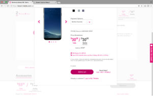
Shopping for wireless has too long been massively over-complicated with needless detail, over-engineered combinatorics, and useless telecom jargon. So we set out to bring the humanity back to shopping for this critical human service. We redesigned the purchase path on t-mobile.com to massively streamline customer effort at a point of purchase by leveraging T-Mobile’s award-winning customer service to handle complexity and fallout.
Our audience consisted of customers shopping for wireless. Our customer cares about finding the best deal quickly, and ensuring they are purchasing a product that fits their needs. They want a site that is easy to use and provides a clear explanation of the product set.
Our strategy was to be noticeably different, but reassuring. We wanted to be overly transparent in how this experience will differ and that it is in the interest of getting them what they need in the best way possible. We also wanted to recognize that consumers show up here thinking they are going to do something a certain way. So we needed to show them they will be doing something different and that it’s going to be okay, in fact, better.
We work for you, so we needed to minimize consumer effort and decision-making. It needed to be radically simple and easy to move through the purchase path at the fastest pace possible. This led to us to empower, but with limits. We thought to give the consumer control over the experience and structured choice in the “how” of interactions. We put them in the driver seat but remained as their navigation.
We also set out to be a humble expert. We wanted the experience to be a delight with a concierge-like experience throughout the journey that shows their distinct needs are our priority and that we know how to address them. We leverage our expertise in this complicated category to make it feel easy and personalized.
- Why this project is worthy of a UX Award:
We created a guided discovery shopping experience that draws consumers to join the Un-carrier and takes the fear and intimidation out of “adding to cart.” Our “Human Digital” philosophy for T-Mobile reflects the brand’s behavior of building real connections between their customers and frontline reps, differentiating them from the faceless, corporate borg interactions of other wireless carriers. We gave consumers new, meaningful ways to connect to the brand & reps throughout their shopping experience. We also created interactions that are fluid, elegant and enable the consumer to do what they way, in the way they want, when they want.
Results
• 4% less traffic is generating: 3X better lead generation & prospect conversions and 485% increase in web orders
• 1 Minute to optimize content in production and 60% reduction in clicks to purchase - Submitted By: SapientRazorfish
- Client Name: T-Mobile
See More 2017 Submissions >>