
View Case Study
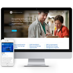
How a fresh UX strategy utilized thought leadership articles and case studies to sell the services of the GE Healthcare Camden Group.
In 2015, GE Healthcare Partners and The Camden Group merged to become GE Healthcare Camden Group, a leading business consulting firm exclusively serving the healthcare industry. Dedicated to solving complex problems within the rapidly changing healthcare industry, the merger poised the company as the largest in the US with top-tier advisory and implementation services for healthcare.
The GE Healthcare Camden Group came to us with a very outdated site that had major usability issues and lacked cohesion with the GE brand. Trusting our team of experts, they looked to us to create a strategy that would elevate the user experience while aligning it with the weight of the GE name and the strong reputation of the Camden Group.
After outlining the goals, we created several wireframe prototypes to test out different website flows that elegantly mixed together thought leadership articles, case studies, CTA's to contact, and the remaining website content. One of the areas of the website that required some deep rethinking was the services section. Their old site had a very traditional services section (title + copy), but we imagined that this section could be so much more. Our UX visionaries saw the services area as a prime place to highlight related thought leadership articles, successful case studies, and powerful CTA's, making copy about the service and related sub-services secondary.
Another area of the site ripe for optimization was the Insights section, where the thought leadership articles lived. Within each article we seized the opportunity to call out connected services, key team members, CTA's to contact, and other related insight articles. We followed a similar pattern with the Case Studies by connecting related services, CTA's to contact, key stats, and callout quotes.
Prioritizing the user experience let us create a website that accomplished the goals to educate, validate, and then drive site visitors to contact them.
- Why this project is worthy of a UX Award:
The GE Healthcare Camden Group website redesign took a website that gave zero priority to the user experience and rethought everything so the best user experience could be realized.
Looking across the web, most B2B websites focus on either talking about themselves, or their products and services. We wanted to buck this trend and focus on information that would provide value to site visitors - the vast collection of thought leadership articles and case studies. Bringing those items to the forefront of the site created increased user engagement and discovery. The restructured site allowed visitors to see the breadth of knowledge the GE Healthcare Camden Group has and the success they have experiences working with major healthcare groups, building validation and trust and driving visitors to contact them.
By thinking through every user interaction on the site and outlining what the audience goals and priorities were, we were able to craft a well-connected and informative narrative across the site. Our UX strategy and design was key to reinventing the flow of information on the site, and guided the GE Healthcare Camden Group to reframe what was important to show their visitors.
- Submitted By: SPINX Digital
- Client Name: GE Healthcare Camden Group
See More 2017 Submissions >>