
View Case Study
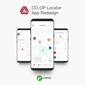
The CO-OP locator app helps users find the closest in-network ATMs and Branch locations in their area.
The CO-OP Financial Service Network is the largest Credit Union ATM Network in the world and users are always looking for convenient ATM and Branch Locations, these searches are often accomplished via CO-OPs mobile apps
The company previously had two separate mobile apps - one for ATMs and one for Shared Branch locations that users needed to download. The app designs and the data associated with them were in need of much improvement and the audience had spoken - the reviews in the app store ranged between 1 - 2.5 stars for both apps.
The previous app was plagued by data integrity issues as well as bad usability. Users complained about unexpected interactions such as map locations disappearing on navigating around the map to limited functionality versus what was available on the desktop.
Our knowledge of best practice, a desire to push innovation and a comprehensive competitive & comparative analysis enabled us to introduce new design patterns into the app that made it easier to use and got users oriented with the full functionality from the start. The new app includes elements such as an onboarding process (tour) that introduces app features and allows users to indicate their primary credit unions for more tailored search results. We modernized the visual design of the app by creating a cleaner design that had fundamental UX/UI principles informed by a blend of material design and modern design techniques. We also kept our work compliant with CO-OP brand guidelines.
Other key app enhancements included:
- An area to add and manage favorite locations
- Use of iOS and Android widgets and 3D Touch / Shortcuts menu
- A scalable global navigation that can grow with the app over time
- Integration with Uber and LyftAfter launch, we listened to our users, and continued to make improvements. CO-OP is also working on improving their data to help users get more accurate results so that both the App UI and the data received match and exceed user expectations.
- Why this project is worthy of a UX Award:
When many people think of credit unions they think of older financial institutions that are combined with a benefits package as part of working fulltime for a legacy company. The goal of our work was to help modernize the perception of our client through technology products to show CO-OP's existing and potential customers that there are Credit Unions and Financial institutions that can take the lead in good design and user experience.
We did our best to leverage the full functionality of the mobile devices we were designing for by adding features and functionality such as the 3D Touch Menu / shortcut menu and mobile widgets. From our perspective every saved tap or click increases user satisfaction and helps to exceed expectations of what a digital experiences are in the modern era.
Our integration with Uber and Lyft also allowed urban and tech adept users to get to their destinations faster and with less effort.While we did our best to balance the business and user goals in the app that we created we ultimately wanted to make a beautiful app that was easy to use and met the needs of the CO-OP'S target audience - their existing customer base along with millennials.
- Submitted By: Orbtec Consulting Inc
- Client Name: CO-OP Financial Services
See More 2017 Submissions >>