View Case Study
Beacon Mobile Calendar is created for working professionals who have irregular working schedules.
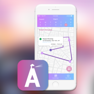
Our project, Beacon, is a mobile calendar application targeting for working professionals with irregular schedules, such as real estate agents, interior designers, or actors. From the user interview, we realized that these kinds of users usually have multiple similar events or schedule events in the different days, or they usually need to commute to multiple places for multiple meetings in a day. We took a chaotic situation and found where the order is - and then found a way to realize that order in a consistent basis.
Beacon is focusing on three features which makes Beacon distinguish from conventional calendar apps.
1. Route Schedule - Route Schedule enables users to see their daily routes on the map at a glance. Users can zoom-in or zoom-out within the map.
2. Routine Preset - Routine Preset allows users to set up multiple routines in advance. For example, users can set a “morning commute routine” with "shower, breakfast, makeup" routines. Time is assigned for each routine, then Beacon automatically sends notifications accordingly.
3. Time Slots - Time slot helps users to set up same irregular events in advance. When users add an event, they can set up the event as a module. Let’s say that a realtor usually spends 3 hours for a open house. He can make a “open house” time slot with a 3-hr time range in advance. Users can choose an existing time slot when they create a same event later.
Throughout the process, we put a lot of efforts on how we can show those three features effectively, pulling out the ideas to visualize and realize on the mobile screen and how we can deliver our messages to satisfy our users and stakeholders.
- Why this project is worthy of a UX Award:
Beacon is meaningful to a UX Award since we made the most opportunity from the people and technology around us, by adding some clever ideas and connecting them to make a user friendly application.
Calendar apps are one of the most common apps these days. Even though there are tons of calendar apps, from our research we found that it is still not easy for our users to find a right calendar.
People don’t just want to see the list of today’s schedule. People may expect more. - For example, I add two adjacent meeting schedules but want to figure out if I won’t be late for the second schedule. Some people underestimate their prep time in the morning. A study said that two different types of people think the same 60-sec differently - one recognizes 57 sec as a minute, whereas the other group does 77 sec. Beacon helps our users to reduce mishaps that may happen due to our nature.
Our project, Beacon, is a faithful calendar, with innovative ideas. We didn’t stick to our ideas only, but we iteratively asked people and applied to the project, keeping the UX process.
- Submitted By: n/a
See More 2017 Submissions >>