
View Case Study
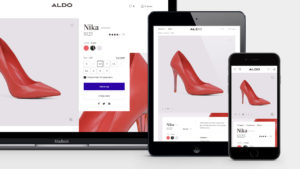
The next step in Aldo’s digital transformation: a premium website and responsive e-commerce platform.
Aldo is the largest global footwear and accessories retailer with 2300 stores worldwide. Yet it hadn't redesigned its global storefront, aldoshoes.com, in a decade. In that time, brick-and-mortar retailers have witnessed dramatic shifts in shopper habits, with non-linear paths to purchase becoming more common. Retailers have also seen a spike in mobile purchases (as much as half of online sales today take place on phones).
Aldo enlisted Work & Co to lead its omnichannel digital transformation, beginning with a responsive e-commerce platform. A major goal? Ensuring this platform could be accessed by all global customers, on any device.
Our approach was to make Aldo’s new website a backbone for powering all omnichannel initiatives, serving shoppers from the moment of inspiration online to when they go to try shoes in store.
We had three guiding principles for Aldo’s website overhaul:
MAKE IT INSPIRING. Most of Aldo’s visitors have historically come in sideways, through search, rather than starting at the homepage. To ensure Aldo’s brand was seen as a style destination, we leveraged the fun, fresh social content they were already creating across the site, making each look shoppable.
MAKE THE CHECK-OUT BLAZING FAST. While most tackle the homepage first, we like hitting the hardest challenges square in the head. So we spent most of our time focused on designing and developing the most important shopper flows: the product detail page and the checkout flow. We had to make sure it converted shoppers.
MAKE IT ACCESSIBLE. A mission from the very start was to prove that accessible sites can also be beautiful, fast, and easy to use. The new aldoshoes.com exceeds AA Accessibility guidelines, so that the shopping experience is fast and easy for anyone.- Why this project is worthy of a UX Award:
The best UX can help a brand transcend established reputation. Shoppers don’t simply flock to category leaders; a simple to use, digital experience can have a big impact on the path to purchase than brand loyalty.
Aldo’s e-commerce platform had to meet the needs of increasingly goal-oriented shoppers once in-store while inspiring online shoppers and get them efficiently through the checkout flow. We also needed to increase revenue for the business.
It's tempting to want to start a website redesign with the homepage, but we started by designing the most complex pages first—the ones that would have direct impact on conversion. We spent weeks refining and testing a single page checkout flow, performing multiple rounds of usability testing as well as technical prototypes to ensure that we could pull together multiple, clunky and rigid third-party platforms into one seamless front-end experience.
The new aldoshoes.com reimagines standard e-commerce templates, a feat only possible with Work & Co’s model of design and development sitting side by side to ensure our designs could be implemented on Aldo’s existing back end platforms.
We’re proud that Aldo not only meets AA Accessibility guidelines, but exceeds baseline accessibility requirements. Grégoire Baret, ALDO’s GM of Omnichannel Experience, emphasized the brand’s desire “to prove an accessible website can be transactional, responsive, and beautiful.” He states: “It was important to create a universal design, for all people and devices, that is as useful as it is beautiful.”
The site launched in April 2017 to the US, Canada, and Europe and continues to roll out globally. Immediately after the initial release:
Conversion is up 20% on both desktop and mobile
The responsive site is already catering to shopper behaviors—half of online purchases are made on mobile
Aldo is on track to see a 20% increase in revenue in 2017 - Submitted By: Work & Co
- Client Name: Aldo
See More 2017 Submissions >>