View Case Study
The fastest visual analytics for big data, with a new innovation to explore time-based data.
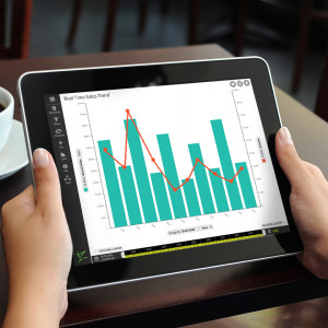
At Zoomdata, we make the fastest visual analytics platform for really big data. People can use it to fuse all kinds of data together, from spreadsheets to Hadoop clusters. The visualizations it makes are intuitive and amazing. It was designed with a touch-first mentality, and works on mobile devices, desktops, kiosks and displays. Our clients have huge amounts of data - trillions of rows of data - and they use our product so everyone at their company, not just data scientists, can make sense of it.
In our entry to the UX Awards, we talk about how we designed the UX of one of our newest features: timelines for big data. In our research, we found that *time* is a great way to put big data on a human scale. However, the traditional timeline UI of a scrubber simply doesn't work on a big data scale. For instance, what happens if you want to examine weather data from the last 100 years on a second-by-second basis? Or if you want to examine transactions from quantitative trading? All of that data simply doesn't fit in a traditional timeline UI.
Our UX Team, which is based in New York City and works closely with corporate headquarters in Virginia, ran user research, designed interactions, and coded javascript prototypes of how a big data timeline should work, allowing users to quickly, intuitively and precisely work on a timeline of any scale, from decades down to seconds, and even working with live streaming data. We then worked closely with our development team to usher it through production. We first started working on it in fall of 2014, and started shipping it earlier in 2015. We continue to revise and improve on our initial work.
- Why this project is worthy of a UX Award:
The main feature of our submission - timelines for big data - includes significant achievements in terms of user research, design, prototyping, and innovation in making big data easy for everyone, not just for data scientists.
Our process started with interviews, where we learned how useful *time* was as a common mental model. Extracting personas from our research helped us to develop specific use cases to define the most common situations, as well as extreme edge cases. During early sketching, we came upon ideas for an infinitely-scaling timeline. These developed into wireframes and early functional specs, which informed us as we moved onto creating prototypes.
The feel of the big data timeline has a great deal of nuance, as we used "elasticity" as a core element for the interaction. Because everyone on the UX team codes, we were able to dive deep into the nuances for the interaction through a series of JavaScript prototypes, and the prototypes themselves became the specification for developers. As the big data timeline went through development, we ran usability testing of early builds with users and made appropriate changes. We harnessed crowdsourcing with Mechanical Turk to develop labels that were meaningful to everyone, allowing us to avoid data scientist lingo that would have sacrificed usability.
While we have a dedicated UX team, it takes an entire organization dedicated to the user to make UX a success. From the CEO who was involved with all the early meetings, down to the developers who crafted the vision into reality (Andrii Prashcharuk deserves special recognition), the success of the big data timeline is really a credit to raising UX to a company-wide strategy.
- Submitted By: Zoomdata
See More 2015 Submissions >>