
View Case Study
SAP Tennis Analytics provides real-time insight to help players and coaches analyze performance and optimize strategy.
The Women's Tennis Association’s (WTA) on-court coaching rule permits coaches to bring a WTA-authorized mobile device onto the court during a coaching break … but they may only have 90 seconds to do so. The coach’s feedback is crucial, as it can change the tide of the match completely. In the past, this conversation was only based on opinions, as the coaches didn’t have any tools to support their observations. After all, coaches and players are human; sometimes what they perceive may not reflect what actually happened.
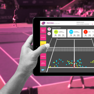
Today, SAP Tennis Analytics for Coaches provides insight to help players and coaches in real-time by translating data from the umpire's scoring of the match and 10 on-court cameras into the tablet application. The coaches and players now have an objective tool that they can mutually trust; they no longer have to rely solely on the observation and manual data tracking. With real-time data provided to them at a glance, the coaches will have more time to focus on driving insights to their players more efficiently and effectively.
The design of the app has also taken into account different environments that the players and coaches face during the match—whether it is a low-light indoor match, or an outside where glare can immensely reduce the data legibility. Through settings, the screens and colors within the app will adapt to these changing light conditions, eliminate distractions, and optimize data legibility.
- Why this project is worthy of a UX Award:
During our design process, we overcame two noteworthy opponents. Our first opponent is content. Today, advanced technology may help the tennis coaches and players gain more access to data than ever before, but too much data is as bad as no data. To overcome this, we started our exploration by talking to our users. We then sketched our design, built the wireframes, and made iterations until the design become digestible and insightful.
Once the design matured enough to be viewed on a tablet, we observed the coach’s interaction with the tablet at work, and adjusted our design according to their behavior and feedback. We maximized the court real estate on the screen and minimized the navigation UIs by moving them to the side of the screen. Now coaches can simply use their left and right thumbs to move from screen to screen without taking their eyes or hands off the tablet while analyzing the game.
On the court we found our second opponent, the environment. Tennis is a sport that can be played and viewed under such extreme conditions. Intense sunlight can cause low-contrast screen to become invisible. This caused our early iteration of the app that had low-contrast color scheme to fail completely when tested under the sun.
To make the matter worse, coaches wear sunglasses while using the app, which muted the colors and rendered the app nearly useless. To overcome this opponent, we created different modes for both indoor and outdoor viewing, and changed the color scheme to high-contrast saturated colors to optimize the screen legibility under challenging light conditions.
We launched the application in August during the 2015 Bank of the West Classic tennis tournament. 70% of the player community tried the app, for real-time match play and for scouting. This includes Angelique Kerber, world number 11, who also happened to be the tournament winner.
- Submitted By: SAP
- Client Name: Co-clients: SAP Global Sponsorships Technology and Women’s Tennis Association (WTA)
See More 2015 Submissions >>