View Case Study
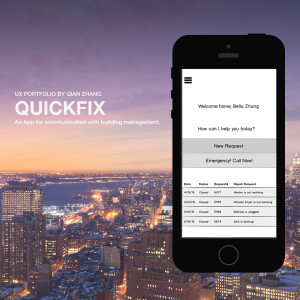
QuickFix is an app that helps residents contact their respective building managements faster and with more ease.
QuickFix addresses the common painpoint of inconvenient and disorganized communication between tenants and their building managements.
After conducting extensive surveys, it seems that many buildings do not have any method of communication between tenants and their landlords or building supervisors besides the traditional method of calling and leaving voicemails. This causes both sides to feel frustrated; and less efficiency converts to less tenant stability and lower tenant satisfaction -- bad for tenants and landlords.
While research has shown a few competitors to be addressing this issue, most of them are unstable. Some crash often whileothers have very low user experience satisfaction ratings. Quickfix is a seamless solution that is purely based on the data of what real tenants have consistently wanted according to multiple surveys and user tests.- Why this project is worthy of a UX Award:
Quickfix is the human intuition's answer to a very common necessity. Its title and its seamless user experience showcase the fact that it is the simplest way tenants and landlords can communicate.
In terms of what tenants and landlords want, research indicates that neither side wants an expansive and all inclusive system. Rather, they want a minimalistic tool that will requires the least amount of effort to communicate what they want from each other. Hence, the title "Quickfix" itself does not speak of anything reminiscent of masonry or buildings but focuses on the results the app can achieve for the users.
And these results are exactly what tenants and landlords want: a quick way to communicate, organize and fix their problems. In the process of doing so, Quickfix emphasizes the reduction of steps and the use of the most popular icons in key spots to ensure that all tenants -- whether native English speakers, 'fresh off the boat', or elderly people less used to techniology -- can easily, quickly communicate their needs and receive confirmation of a response immediately. An example of an intuitive use of such an icon is when the user may upload a picture or video for the management to watch and have on file for the 'fix'. The icon used is the universally familiar camera and video icons and both can be achieved with a single click and then submit. For the building management, this provides all the information necessary for a proper response; for the tenant it is a process as easy as using their phone cameras; for both sides it will eliminate the common step of workers having to come in and check the problem even after the problem has been communicated.
Thus Quickfix is a seamless solution to a universal painpoint and is a solution so familiar and simple that users will not even think twice about it after using it.
- Submitted By: N/A
See More 2015 Submissions >>