
View Case Study
We took a design-centered approach to building enterprise-grade mobile device security that embraces complexity and delivers simplicity.
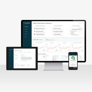
From January of 2014 to June 2015, Lookout’s enterprise product design team developed a mobile security solution for enterprises. The product includes an iOS and Android app for employees which notifies them in the event of a security issue, and a web console for Information Security and IT workers to deploy the app, define policy, configure settings, and view detailed threat event information.
Our team of designers and researchers took a design-thinking approach to the problem, utilizing paper prototypes, motion prototyping, user interviews and usability tests, along with experience design methods such as journey mapping, lightweight personas, and task flow diagramming.
Our solution focuses especially on making the process of inviting users and getting them to activate the app tremendously fast, intuitive, and simple. Also, in contrast to virtually all other enterprise security products, Lookout Mobile Threat Protection also has meticulously crafted visual design language, with great attention paid to typography, hierarchy, and information density.
- Why this project is worthy of a UX Award:
Enterprise software has traditionally been a different experience compared to products developed for consumers. Today, Enterprise users have the same expectations that consumers do. They are confused by bad navigational structure, have trouble reading tiny text, and prefer a better experience — they just might have less of a say in which products they use. Lookout started out in consumer mobile security , and now has delivered an enterprise product through a user-centered design process.
Research and design are embedded in the product team for Mobile Threat Protection, or MTP. We have an iterative process that includes research in product development from the beginning. We talked to potential customers in different roles to solidify our understanding of the space and the problem, and made sure that all of that fit within business goals and strengths. Our research methods and prototypes changed with each phase of development. Early on there were paper prototypes, concept validation, and quick and dirty testing with internal employees. Later, we moved into more interactive tools like InVision and framer.js. Engineers and PMs were involved with product planning and customer feedback.
We took great pains to make the experience of configuring, deploying, installing, and maintaining the product tremendously simple and intuitive. In our pre-sales talks, our attention to user experience is seen as a differentiator and still something that isn’t taken for granted. So far, we’ve heard fantastic feedback from our customers: that the product is very easy to get up and running, and that tasks that typically require documentation in other products were easy to accomplish in MTP with no help at all.
We believe that the design of a user’s experience is a multifaceted endeavor that must tie in business goals, user problems, and a delightful experience, and we rely on user-centered design processes to build the strategy, empathy, and knowledge required to achieve truly great UX. - Submitted By: Lookout
See More 2015 Submissions >>