
View Case Study
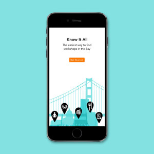
Know It All is the best way for active adults to find workshops and classes in the Bay Area.
Know It All is a mobile app that I conceived of and designed to take the frustration out of finding the best workshops and classes in the overwhelmingly abundant Bay Area. It’s designed to serve adults who want onsite, in-person classes, workshops, lectures and other recreational learning events.
I completed the entire product lifecycle from original idea inception to launch-ready visual/interaction design in 12 weeks, covering all steps of the UX and product design process: concept ideation, market research, competitive analysis, user research, personas, feature prioritization, feature release roadmap, information architecture, navigation, wireframes, visual design, usability testing, rapid iterations, and interactive prototyping. By connecting with users and diving deep into the research, I learned about their goals, needs and pain points, and I designed solutions to get the most relevant content in front of them, with the least amount of effort on their part as possible.
How it works: Know It All lets users search, browse or customize the app to their preferences, so they can find out when a class/workshop that they’d be interested in becomes available. Filters, favorites, to-do lists, and archived accomplishments help the user create a personalized curriculum for an exciting and engaging life of learning. Know It All utilizes the best features of hook/trigger design, passive search, and playful reminders to provide an experience that solves one of the most frustrating aspects of recreational learning: the hunt for meaningful information.
- Why this project is worthy of a UX Award:
Know It All is worthy of a UX Award because it expertly applies UX protocols and user-centered design principles, and because the entire process from start to finish was able to be completed in only 3 months. It demonstrates that high-quality UX design can be done with limited time and resources. This one-woman-show wore a great many hats. I’m really proud of how the effort I put forth to connect with users and keep them at the core of every decision, led to an exceptional experience design solution that meets their needs with the least amount of effort on their part as possible.
Perhaps this story will inspire others to dive in, whether they are new to the industry, recent converts transitioning from other fields, or someone in the Pro-Am audience who can only practice these skills on nights and weekends. This project shows that great UX work is possible under any circumstance. I love that the UX Awards allow us to share projects like this that aren’t launched yet — it democratizes the evaluation of “what is good UX” and allows many more people to be both participants and part of the conversation.
- Submitted By: Kat Vellos
- Client Name:
See More 2015 Submissions >>