
View Case Study
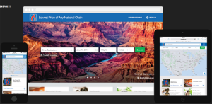
Leveraging demographic and behavioral data, Motel6.com is responsive with effortless, personalized, and geo-dependent booking.
When Motel 6 tasked Code and Theory to redesign its website across desktop, tablet and mobile, the goals were clear: Increase conversion across all visit occasions while optimizing and personalizing the booking experience.
The solution involved more than just moving the company’s static, template-based website to a more responsive design, where each page perfectly adapts to any screen size. It also involved completely rethinking how design and technology can better serve Motel 6 customers—anytime, anywhere, and from any device.
Over the course of several months, Motel 6 and Code and Theory partnered on creating a more responsive and powerful system for Motel 6. A focus on personalization, pathing, speed, and usability laid the groundwork for the website redesign.
- Why this project is worthy of a UX Award:
Motel 6’s core customer is someone who needs to book a room at the nearest hotel, as soon as possible. Knowing this, the two core principles of simplicity and personalization were key, and made their way into every aspect of the mobile-first redesign - from search to checkout. We sought to short-circuit the purchase path for every kind of user, from frequent customers to potential bookers. This meant significantly reducing the number of clicks required to book a room.
We adopted a "mobile-first" approach as this prioritized the user on the move—Motel 6’s most common motel guest. We simplified the booking process by condensing a lengthy checkout flow into a 3-step process. A card system suggesting local restaurants, events, and attractions personalized the experience.
We presented a potentially overwhelming amount of information to users in a manner that ensured only the most relevant information appeared at the right time. It’s why the opening page is a geo-located map situated next to a listing of available hotels near the user’s location. Also, a "Suggested Properties" module surfaces properties relevant to the user for direct access on the home page: upcoming reservations, recent stays, recently searched, and promoted properties. A global "booking widget" allows users to search for a new property or location at any time in the experience. Further, the final checkout page includes features like a 1-click purchase option via Google Wallet.
The product was initially released as a gated beta, rolling out to small percentages of users across all viewports, with those percentages increasing over time. We continually monitored performance and addressed many optimizations to the design during this beta phase. Real users provided the best feedback on how to improve the site before full launch.
The site redesign launched in February, 2015. From February, 2015 to April, 2015, the company saw desktop conversion rates increase 28%, and mobile conversion rates.
- Submitted By: Code and Theory
- Client Name: Motel 6
See More 2015 Submissions >>