
View Case Study
Wanelo is a dangerously addictive shopping experience used by millions of people every day.
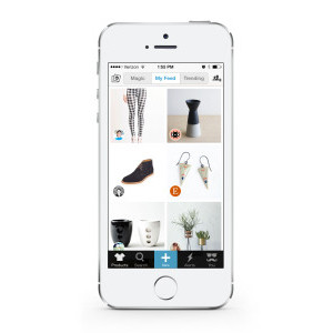
Wanelo (“wah-nee-loh,” from Want, Need, Love) is a digital mall at your fingertips, used by millions of people to discover and buy the most incredible products on the internet. It contains all stores and products in one place, so that you don’t have to go to each store’s website individually. It’s a place where you can discover the most amazing products on the internet. The Wanelo Shopping App is a highly personalized and addictive shopping experience on mobile. When you first sign up, you start by following your favorite stores and people you like. This creates a personalized feed of products just for you. Every time you visit Wanelo, you’ll see new products from all of your stores. When you find something you like, you can buy it or save it into your profile for later. While the average mall contains 150 stores, Wanelo has over 300,000 stores ranging from independent boutiques to big brands we all know - all in one place. Thousands of new products are added to Wanelo daily by its members which allows Wanelo to be the place of endless discovery for shoppers.
- Live Project Link: https://itunes.apple.com/us/app/wanelo-shopping/id550842012?mt=8
- Why this project is worthy of a UX Award:
Wanelo is not only solving a huge problem in e-commerce, it is creating a shopping experience that focuses on the users by connecting them to products and stores relevant to them in one seamless place. The experience of online shopping is disorganized and fragmented. Wanelo uses a clean, simple and straightforward interface that not only personalizes the shopping experience, but encourages discovery of new and unique products. When we designed the app, we focused on the products, the users and collections. We were able to remove extra features that weren’t core to the Wanelo experience. We simplified the app to create the most engaging, fun way to discover new products online and help people develop and express their sense of personal style. The simplicity of Wanelo’s user interface allows us to build new features quickly and be very iterative in our approach. We practice data-driven design by looking at key metrics to guide the design decisions, and we validate new features through prototyping and user feedback before investing heavily into implementation. Ideas for new features often come from our passionate users through app reviews, tweets and comments. User testing sessions in-person and online, A/B testing, interactive prototypes are all crucial steps in our design and review process that help us not only listen to our users, but allow us to incorporate their feedback and suggestions into our ever-evolving app. We believe the future of retail will require a single dominant social platform for shopping, and this is what we are building. Wanelo Save buttons are being added to retailers’ websites, right next to Facebook, Twitter and Pinterest - all multi-billion dollar companies - indicating the growing importance of Wanelo to retailers. Because of Wanelo’s beautiful design, simplicity of use and its ability to solve traditional challenges that consumers face while shopping, the company has seen tremendous growth - all attributed to word of mouth. As of August 2013, we have 11 million users (up from 1 million users in November 2012). Now millions of people are using Wanelo every day to find and buy products they love.
- Submitted By: Wanelo
See More 2014 Submissions >>