
View Case Study
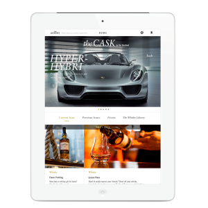
The Cask is a modern interpretation of The Glenlivet’s heritage through a viscerally intuitive App.
The Cask was The Glenlivet’s fledgling iPad magazine provided to the brand’s members-only enthusiasts. However, the user experience and design was third-rate. Our remit: redesign the magazine to match the quality of the design and experience to the quality of the content – and to the high standard of The Glenlivet. We needed to create a beautiful – but flexible – design system that appealed to a wide range of men. The system had to be completely template so that the editorial team could lay out the entire magazine every quarter. Objectives: 1) grow the circle of enthusiasts by driving demand, 2) Deliver equity to The Glenlivet via the publication, rather than draw from it, and 3) build the brand’s super-premium aesthetic through the design. We executed a bedrock design concept: modern heritage. The rich historical visual identity of The Glenlivet was extrapolated into a modern interpretation. This was manifest in the strong, clean typography, by innovatively maximizing imagery size handled via interface layers. The interface serves discovery and targeted reading equally well and intuitively, creating a bold and masculine, yet refined, distinctive experience.
- Live Project Link: https://itunes.apple.com/us/app/the-cask-by-the-glenlivet/id767712068?mt=8
- Why this project is worthy of a UX Award:
Initial user reviews are outstanding and this platform has become a significant premium offered to drive CRM program membership. The editorial team is able to publish 100% autonomously while achieving excellent design and experiences in each edition. Launched with the December 2013 Holiday Issue, The Cask by The Glenlivet has shown early success with its first month of consumer CRM registrations exceeding those earned in the entire preceding year.
- Submitted By: Deep Focus
- Client Name: Pernod Ricard
See More 2014 Submissions >>