
View Case Study
Department of HHS with Aquilent redesigned Usability.gov to be more useful, responsive, accessible and innovative.
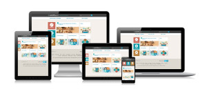
The new Usability.gov not only has a pioneering new design; it also reflects our new expanded purpose. Our goal was to reintroduce the site as a leading resource for user experience (UX) best practices. While redesigning the site, our research connected us with UX professionals and digital communicators throughout government and in the private sector. Our findings helped us to develop a new information architecture, create and refine content, and experiment with and update the design’s look and feel. The site is focused on what our users need to create usable digital content. Built in Drupal and hosted in the Cloud, this responsive site was designed with a mobile-first approach. Usability.gov features a responsive tile design, a top-task dock, and tagged content, as well as site and page-level surveys to allow users to provide feedback on whether content was helpful, and how we might improve the site.
- Live Project Link: http://www.usability.gov/
- Why this project is worthy of a UX Award:
One of the cornerstones of Usability.gov is User-Centered Design (UCD), its principles, and its best practices. Early on, we decided on strict adherence to UCD, assuring that we not only “talk the talk,” but “walk the walk.” Leading by example, our UCD process included numerous rounds of user feedback, needs assessments and iterative usability testing. Through this very rapid, iterative testing and informal Agile process, we were able to quickly evolve the designs to more effectively meet peoples’ needs. The redesign of Usability.gov allows people to interact with the site and the content in a way that is revolutionary in government websites. The site’s content is accessible whether using a traditional keyboard and mouse, using gestures on a touch screen from a mobile device, or using assistive technology, such as a screen reader. Our site, like our work, is dynamic. We are continually investigating ways to improve the content, functionality and overall user experience of the site.
- Submitted By: Aquilent on behalf of the U.S. Department of Health and Human Services
- Client Name: U.S. Department of Health and Human Services
See More 2014 Submissions >>