
View Case Study
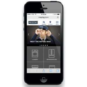
New mobile website designed using collaborative, iterative process, user research, and usability testing.
"As part of an effort to update its brand, Maytag sought to improve its mobile web experiences for a new generation of customers. As we learned, today’s target audience uses mobile devices in many contexts: as a second screen, on-the-go, and in the store. They expect a seamless experience on any device. To get users the product information they needed, when they needed it, DigitasLBi set out to design a richer mobile experience for Maytag. We started with user research. Field studies, shop-alongs, homework assignments, and curated competitive research gave the team a 360-degree view of how, when, and why Maytag shoppers use technology. The team discovered that shoppers wanted to use mobile devices to browse and research products, find the nearest retailer, and compare products. These findings led to revised personas and consumer journeys that informed the mobile design. We accounted for a wider array of users that ranged from design enthusiasts to duress buyers deeper in the purchase funnel. Our research informed our design. We added a robust “where to buy” functionality that allowed users to find specific appliances near them - a real convenience for users on-the-go. Because we found that our users wanted to compare prices while shopping in store, we tested out a variety of approaches before settling on an optimized compare functionality for launch. We owe our successful launch to a collaborative agile process, which included efforts between UX, design, development and dedicated business stakeholder from Maytag. Once the design went live, the proof of our efforts followed: Bounce rates decreased by 40%, engagement increased, and users could now complete their tasks easier and more intuitively."
- Live Project Link: http://www.maytag.com/
- Why this project is worthy of a UX Award:
The collaborative effort between the user-centered design team and client resulted in a successful launch of the new mobile experience. By following a user centered approach, including continuous feedback from users via testing, a best-in-class mobile site was launched that addressed key tasks.
- Submitted By: DigitasLBi
- Client Name: Maytag
See More 2014 Submissions >>