
View Case Study
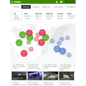
Access to account positions, watchlists, world market data, investing ideas— with immersive real-time data visualizations
In combining customer research in various forms and leveraging Apple’s iOS7 key attributes, we designed a new way of accessing financial information. With the new Fidelity iPad Dashboard, all of the financial information that matters the most is at your fingertips. Swipe through customizable Dashboard categories for instant at-a-glance access to your account balances, positions, watch lists, US & international market data, and investing ideas—all with immersive real-time data visualizations, contextual third-party news, research, and guidance from Fidelity Viewpoints®. Users can customize the Dashboard view they want to see when they access our iPad App with key information at-a-glance. And when they have more time, they can “lean back” and have a differentiated experience with immersive visualizations to showcase market and portfolio attributes. They can research, read and watch videos related to their account holdings and watch lists. They can tap, swipe, pinch, zoom and more to visualize what is happening in their personal financial worlds.
- Live Project Link: https://www.fidelity.com/mobile/ipad
- Why this project is worthy of a UX Award:
We took huge amounts of data and organized it to tell a compelling, customized story for each and every user. Complexity was simplified to drive user engagement. The new look and feel – colors, design and graphics aren’t overwhelming. Additionally, with the iPad’s breadth of screen, we are allowing users to “lean back” and have a differentiated experience with immersive visualizations to showcase market and portfolio attributes. Within 24 hours, we had 150K downloads of our iPad App and over 500K to date.
- Submitted By: Fidelity Investments
See More 2014 Submissions >>