
View Case Study
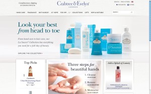
Redesign of crabtree-evelyn.com.
Shopping at a Crabtree & Evelyn retail store is an entirely sensory experience. Sampling the soaps and lotions and smelling all the different fragrances is a big part of the purchase process. The sweet-smelling shops also bring to life Crabtree & Evelyn’s quintessentially English charm. The challenge for us was to bring the tangible, luxurious world of the Crabtree & Evelyn product experiences online in a highly-branded, best in class, multi-channel ecommerce experience. We began with the brand. Since Crabtree & Evelyn encapsulates all things English, we reached out to our London office to get some cross-cultural insight. We also worked with the client team to explore the Crabtree & Evelyn brand identity. We developed personas, used Pinterest to catalog our inspiration, created moodboards, explored voice and tone, and presented a series of design concepts. This deep dive helped us craft guiding principles and an approach that set the course for the entire redesign effort. Once we honed in on a direction, our design team introduced beautiful, high-resolution photography to better showcase the products and give them greater star power. And to coordinate with the vibrant imagery, we wrote illustrative, thematic language to establish the tone of the site, and bring to life the charmingly British brand voice. As beautiful as the new site looks, its performance is even more impressive. Crabtree & Evelyn has seen increases in traffic, time spent on site, conversion rates, and average order value. We’re proud of what we accomplished in the two months since launch, and the Crabtree & Evelyn client team is looking forward to a strong year ahead.
- Live Project Link: http://www.crabtree-evelyn.com/
- Why this project is worthy of a UX Award:
The redesign of www.crabtree-evelyn.com was exceptionally transformative. Our project team took the existing website and reinvented it into an engaging retail experience that brings the brand to life. Bold beautiful imagery boosts each product’s star power. Reimagined UX design presents products as curated collections and creates more—and more simplified—paths to products. Fresh new copy speaks to the customer in the Crabtree & Evelyn quintessentially British brand voice, and lends consistencies throughout the site and across geographies—just like the Crabtree & Evelyn retail stores do in the offline world. The new site empowers customers to shop online the way they do offline finding and buying gifts for friends, treating themselves to luxurious products, immersing themselves in the brand, while having the commerce functionality to support them. It also enables decision-making through rich content, personalization and a sense of community.
- Submitted By: SapientNitro
- Client Name: Crabtree & Evelyn
See More 2014 Submissions >>