
View Case Study
Our challenge was to expand the essence of MSNBC beyond the current TV experience.
The MSNBC brand was well established in television, but its digital presence was inconsistent and disjointed. msnbc.com was a general news site that didn’t reflect the progressive leanings of the brand. Their remaining digital activity was geared more towards marketing their shows. MSNBC wanted a unified digital experience that could become the digital home for progressive people. Our challenge was to expand the essence of MSNBC beyond the current TV experience. We needed to use digital to transform the broadcast TV news experience into a community dialogue, which centered around the issues that mattered to their audience. “To Move Matters” became our strategic call-to-action for making experience decisions. “To Move Matters” spoke to moving the conversation on the issues that shape our world. The experience we designed needed to get people to “Do One More Thing” and had to have a "Return on Involvement" that rewarded these actions. It needed to move users from passive viewers to passionate activists. And it has. Since launch, Daily visitors have increased 164% and content consumption has increased 291%. But most importantly, social sharing has increased 173%, as MSNBC’s audience is connecting in its attempt “To Move Matters.”
- Live Project Link: http://www.msnbc.com
- Why this project is worthy of a UX Award:
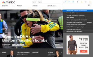
The Experience Design Concept: The Seamless Community We knew we needed to build on the strengths of their shows, but we also understood the need to expand the content across time and devices. We needed to turn the one-hour show experience into a 24-hour, always-on experience that invited people to connect and become involved. We focused on building an ever-growing, hyper-connected community organism that could adapt, split apart and rebuild—in which each cell can live on its own, but only comes truly alive when it is in action together. It would be an organism whose diversity in thought is only matched by its unity in purpose: To Move Matters. This led to a modular design approach that allowed MSNBC to foster many different forms of community and test many types of content consumption combinations. We ultimately built a dynamic content experience that could adapt to the passion and actions of the community. But even a seamless community needs some organization, so we created a site navigation structure that matches the spectrum of action of our different progressive personas. People can move from the "Explore" and "Watch" stages to the "Join In" and "Speak Out" stages, as they themselves progress from novice to activist. We also integrated discussion and community throughout the content consumption experience. For example, instead of employing the category convention of having to scroll to the bottom to comment or see what people were saying, you can join the discussion at any point by clicking the “Join the Discussion” bar on the right side, whereupon the content and the community engagement experience folds into itself and becomes one organism. The Visual Design: a Bold Editorial Approach We knew that a progressive site needed a progressive design. Most news sites follow a news theme design with the categories listed on the top. Instead we opted for a more editorial feel, showcasing 10 stories at a time and using powerful photography to create focus and impact. The headlines are carefully crafted and supported by bold imagery. The content is bite-size and snack-able, which encourages the user to click one more time. The overall design language supports the task-based behavior of the experience. There's lots of white space with simple, spacious and bold typography that matches the new MSNBC brand language. The simplistic color palette frames the content nicely, but calls attention to the actionable and active elements of the experience. We developed a differentiating design system that would easily scale across all devices and support the content experience instead of taking away from it. We developed a site that felt cohesive and aligned with the MSNBC brand, so that users would always be reminded of the site they were on. The Results 7 months after launch every important metric is in steep incline. (Sitecatalyst 7 months post 10/13 launch date) Visits per day are up, on average, 164% Article views per day are up 291% Daily newsletter sign up (loyalty) is up 466% Social share per day are up 173% Video completes (really important for a broadcast company!) are up 93% Not only has the MSNBC brand benefitted from the experience overhaul, but the sub-brands have, too. Every show ecosystem is up in traffic as well (Rachel Maddow show up 42%; Morning Joe up 12%; Hardball with Chris Matthews up 9%; Politics Nation with Al Sharpton up 8%; All in with Chris Hayes up 8%; Last Word with Lawrence O’Donnell up 7%). And the Return on Involvement objectives are being met with 134,679 people following issues, 54,112 joining groups. But most importantly, the MSNBC digital experience is a thriving active community that is fueling its own growth. As more members connect, share and promote their personal passions, more members are brought into the community. This, in turn, continues to give the MSNBC brand and community the true scale and force To Move Matters.
- Submitted By: SapientNitro
- Client Name: MSNBC
See More 2014 Submissions >>