
View Case Study
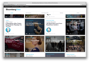
The website for Bloomberg View is designed to feel lightweight and dynamic like an app.
The website is responsive and scales to any screen size, from mobile and tablet to desktop. The design followed a content-centric approach with the goal of representing articles in the most direct and engaging way possible. Articles and columns are shown as tiles that present content in a clear and compelling way, and reflect the frequency that content changes on Bloomberg View throughout the course of the day. You can see an overview of topics for the day, and dive deeper into those topics you care most about.
- Live Project Link: http://www.bloombergview.com
- Why this project is worthy of a UX Award:
The navigation is based on a single page model and a scrolling view of tiles that can be filtered in a variety of ways, from articles by a specific contributor to articles about a specific topic. The interface simply gets out of the way and lets you engage directly with the content. The project is a departure from the main Bloomberg website and offers a fluid, lightweight interface to reading the news. Since the new website launched, the site has been seeing higher engagement.
- Submitted By: Schema Design, LLC
- Client Name: Bloomberg View
See More 2014 Submissions >>