
View Case Study
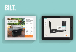
BILT empowers consumers to assemble products in a new, intuitive way with interactive, 3D-guided instructions.
BILT is an interactive, 3D-guided app that helps consumers assemble and install products. Easier than paper instructions (and far more fun), BILT will act as a helpful DIY friend by empowering people to take on projects they never thought they could. It is currently available for iPad, with Android tablet support coming soon. BILT features: - Simple search that allows people to look up the product they’d like to put together. - 3D, interactive assembly instructions where people can see all the pieces come together in a simple animation, zoom in to see any details, rotate to get the angle just right, and walk through the assembly process at their own pace. - Simple product registration and warranty tracking under one roof, so people always know they’re covered. - A beautiful, intuitive design that makes product assembly easy and rewarding.
- Live Project Link: http://www.biltapp.com/
- Why this project is worthy of a UX Award:
From idea to prototype to pilot, we employed design thinking principles to craft an experience that solved a REAL problem most people can relate to and do it through an app that’s simple, intuitive, and a joy to use. “Simplify. Simplify. Simplify.” was our mantra. We focused on surfacing the most important information and letting everything else recede into the background. Paper prototyping allowed us to quickly iterate, test, and pivot. We initially diverged with a rich set of ideas, then built on or fused those ideas to crystallize and converge on the core structure for the app. It was very important that our app looked as good as it felt. We used a wall at the coffee area (yes, high tech, we know!) to gather feedback in our Palo Alto and Cambridge offices where people could look at design options while grabbing their coffee and leave feedback using sticky notes. We also followed up with a quantitative simple online survey. This was only possible because everyone in our offices could relate to the core value of the app. They were all end-users we could readily test with. Through these exercises, and quick iterations that followed, we were able to narrow down our interaction, motion, visual, and copy style with a high level of confidence. We designed the visual language of BILT to be expressive and intuitive. Tools look like tools, model number looks like a model number, average time to assemble looks like a timer. We simplified the registration process down to the basics so people could get warranty coverage for their products as quickly and easily as possible. We made sure the 3D models available through BILT were clear with easy to follow instructions. All these details were iterated and tested many times until we got them just right. In our usability tests, we asked participants to build a grill using only our app. Most of our them had never assembled a grill before. At the end, the sense of accomplishment people felt was unparalleled. “It feels good to say that I did it myself” “There’s no way I would’ve attempted this before” were sentiments repeated by many of our participants. The final product has been received with a tremendous level of excitement by both consumers and manufacturers. The responses we hear most often by end-users is “Wow, when can I have it?” “Can all my products be in this app? You mean I may no longer need my drawer full of paper manuals?” “Wow, beautiful!” and really, that’s pretty cool and gratifying… we could not ask for more.
- Submitted By: SAP AppHaus
See More 2014 Submissions >>